AKKA/LAA
Content design / team guide

Template for a user-friendly
content page

Give users a brief overview of what AKKA/LAA can offer them,
then provide clear, quick routes to detailed information and next steps.

Answer users’ questions:
Is this for me?How can AKKA/LAA help?How does it work?What next?
1

Main title

Explain who this page is for and the benefit users can get. Help them recognise their situation and choose their next step.

Primary action
Relevant person, activity or contextImage placeholder
2

Benefits

Benefit for the user

Describe a practical outcome they can expect.

Less effort or complexity

Explain which tasks AKKA/LAA handles for them.

Clarity and support

Show how the service helps them understand what happens.

Choices and conditions

Make their options and essential limitations clear.

3

How it works

1 Usage data →

Explain which uses are recorded.

2 Allocation rules →

Show which rules apply to this category.

3 Rights shares →

Explain how the amount is split.

4 Final amount

Clarify deductions and payment conditions.

Royalty calculation rules
4
Topic-specific image

Topic-specific information

Explain the scheme, requirement or distinction that matters for this topic. Pair a relevant image with a short, useful explanation.

Explore requirements and guidance
5

Stories from this audience

All stories

Real experiences that help people understand the service.

▶
Video placeholder
[Name] · [relevant role]Starting the journey
▶
Video placeholder
[Name] · [relevant role]Using the service
▶
Video placeholder
[Name] · [relevant role]The difference it made

Story prompts only · add real participants and approved videos

6

Ready to start?

Join 7,000 authors, musicians and artists in Latvia and have your rights represented by AKKA/LAA.

Primary action
7

Frequently asked questions

Who is this service for? +
What choices or conditions should I know about? +
What if my situation changes? +
8

Questions? Contact us

[Name], [relevant team and role]
[Working days and hours]

AKKA/LAACategory navigation  ·  Contact  ·  Privacy
One consistent structure.
Adapt the examples and category-specific modules.
Essential information stays visible.
Full procedures, rules and forms sit one level deeper.
AKKA/LAA
Companion notes

Visual examples
and template notes.

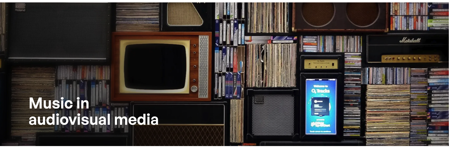
Stim example: a collection of records, amplifiers and screens behind a topic title
Example from stim.se

Let the image establish context

The records, screens and audio equipment connect the heading to audiovisual media. The short title has a clear place in the composition, while the dark image treatment helps the white text stand out.

Apply to AKKA/LAA: choose a recognisable activity or setting for the category. Keep the text area calm and check contrast for the final crop.

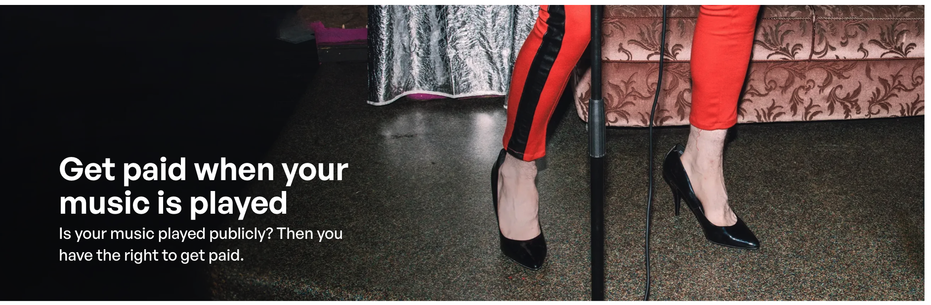
Stim example: a musician beside a microphone, with a headline about being paid when music is played
Example from stim.se

Connect a real situation to a useful outcome

The headline leads with payment, giving users an immediate reason to read. The subtitle names a familiar situation: music played publicly. The performer and microphone reinforce that context; darker space behind the text keeps it readable.

Apply to AKKA/LAA: state the benefit in plain language, then explain who it applies to. Use imagery that supports the same message.

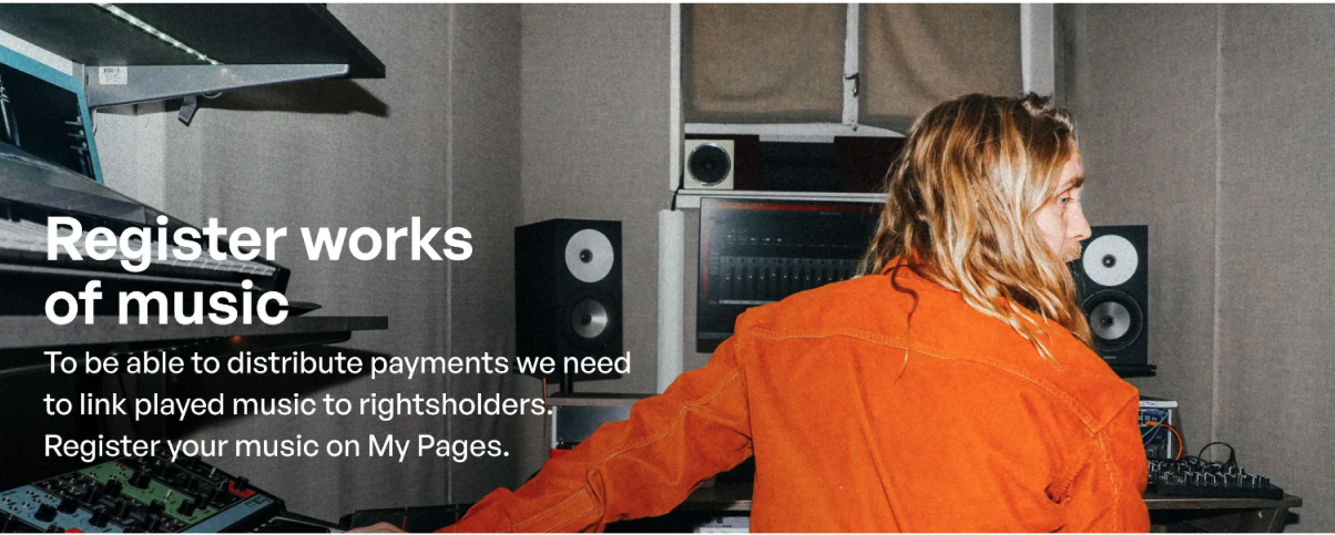
Stim example: a person working in a recording studio beside a work-registration heading and explanation
Example from stim.se

Tell users what to do and why

The title names the task: register music. The supporting copy explains why registration is needed and where to do it. A person at work in a studio gives the task a relevant human setting, while the person remains clear of the text.

Apply to AKKA/LAA: pair the next step with its purpose and destination. Adapt the requirement to the topic; music registration is not a rule for every author category.

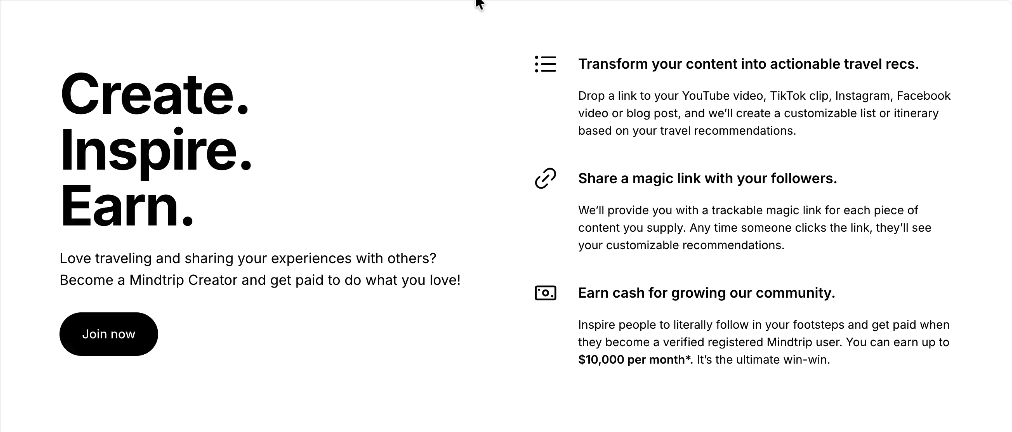
Mindtrip benefits example with Create, Inspire, Earn on the left and three icon-led benefits on the right
Example from mindtrip

Make benefits easy to scan

A short promise and one action sit on the left, while three benefits are grouped on the right. Each benefit has a small icon, a clear heading and a short explanation, making the value easy to scan.

Apply to AKKA/LAA: pair a concise value statement and primary action with a short list of concrete benefits. Use icons to support the headings and keep each explanation brief.

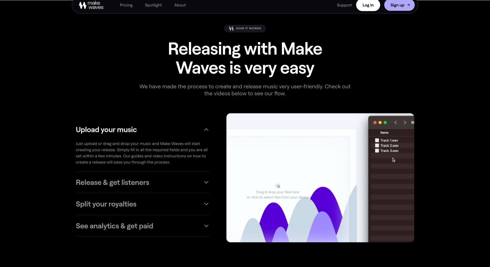
Make Waves process example with labelled expandable stages next to a product demonstration
Example from makewaves.fm

Pair process steps with a demonstration

Short stage labels make the journey scannable. An expanded explanation beside a product demonstration connects the instruction to what users will see.

Apply to AKKA/LAA: combine a short process with a relevant example or explainer. Show essential information without requiring every step to be opened.

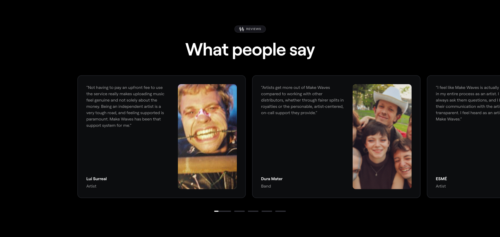
Make Waves social proof example with quotations, named artists and portrait photographs
Example from makewaves.fm

Connect social proof to real people

Portraits, names and roles give each experience a clear source. The quotes describe specific aspects of the service, helping visitors judge whether the experience relates to their needs.

Apply to AKKA/LAA: use approved stories from relevant authors. Include a name, role and concrete experience; make stories accessible without relying on a carousel.

Design observations, not measured usability or conversion results. Sources: supplied Stim.se and Mindtrip screenshots, plus Make Waves page captures. All examples are shown for internal design discussion.

Notes for adapting the template

1Topic introduction and benefit

Replace the instructional heading with a clear topic name. Write a subtitle explaining who the page serves and the benefit users can get. Use one primary action whose label matches its destination. Pair the introduction with a relevant image and appropriate alternative text. Keep breadcrumbs above it and category navigation below the full-width hero.

2Benefits

Replace the benefit prompts with practical, supported outcomes for this audience. Explain which tasks AKKA/LAA handles and what users choose or provide. Make essential eligibility, rights, licensing or service limitations visible where users make a decision. Put the complete explanation on a linked detail page. Avoid promises the service cannot support.

3Explain how it works

Use this block for any process relevant to the page. Break it into a few clear steps, explain what happens at each stage and link to the full guidance. Royalty calculation is one possible example: usage information, allocation rules, rights shares and the final amount. Adapt the steps to the actual process rather than treating this example as a universal sequence.

4Topic-specific information

This block is optional. Use image and concise text to explain a scheme, requirement or distinction that matters to this audience, or to introduce a related subject and guide users to another content page. Label the link clearly so users know what they will find. Include the block only when it helps users understand or choose their next step.

5Author stories and testimonials

Feature authors who have an agreement with AKKA/LAA. Use captioned videos or quotes with photographs, names and relevant roles. Share specific experiences that help visitors understand the service. Obtain permission to publish each story and image. Provide video transcripts and visitor-controlled playback. The mockup names and story titles are placeholders and editorial prompts, not testimonials.

6Ready to start?

Place this invitation after the video stories. Use a concise benefit and one primary action with a label matching the destination. The mockup uses the requested draft copy: “Join 7,000 authors, musicians and artists in Latvia and have your rights represented by AKKA/LAA.” Confirm the figure, date, audience definition and representation wording before publication; the number is user-supplied and has not been verified. Adapt the invitation to each page and keep one primary action.

7Frequently asked questions

Replace the sample questions with the audience’s actual remaining concerns. Avoid repeating content from earlier sections. Use accessible accordions with clear labels and keyboard support. Include supporting links inside answers when useful. Keep essential eligibility and service limitations outside collapsed content.

8Contacts

Use the established contact wireframe: circular staff portrait, a clear invitation to get in touch, name and role, working hours, telephone and email. Select the team responsible for this topic. Replace every placeholder with confirmed information and use functional telephone and email links. Use a real staff photograph only when it represents the contact shown.

Apply across the template

Separate navigation purposesPlace the existing right-hand category navigation below the hero, with its current-page state. These links open neighbouring pages. Add a distinct “On this page” anchor list only when page length warrants it.

Use the guide selectivelyUse only guidance relevant to the chosen audience. Check which rules, schemes and requirements apply; keep topic-specific modules optional.

Let visuals explainPrioritise the process, relevant examples and information panels. Use readable text, identifiable links and sufficient contrast.

Keep detail one level deeperUse this page to explain the essentials and help users choose a next step. Link to detailed rules, forms and procedures instead of reproducing them here.

Basis: supplied content-page guidelines and review comments, generalised for reuse. All headings and body copy inside the mockup describe the intended content; replace them with audience-specific copy before publication. Bracketed values are placeholders. Figures and story prompts are not claims or testimonials. Verify final copy, facts, destinations and contact information.
Scope: no live-page, mobile, keyboard or measured contrast audit has been performed for this infographic.